Fabrico · Sewing patterns, e-commerce · International
3
platforms — iOS, Android, web — from one codebase
The shop was beautiful. On a phone, it wasn't.
3 weeks
More salesRun it yourself

More sales
Customers decide on a small screen, between other things. What changed when a pattern shop rebuilt its app around that.
Fabrico sells downloadable sewing patterns. The catalogue is good, the brand is good and the website works. What didn't work was buying a pattern on a phone.
The existing app was functional. It felt like a website pressed into a smaller space. That is a different thing from an app made for a phone from the start, and the difference shows up in sales.
Pattern customers browse on phones. They discover a design, check the photos and the size range and decide, quickly, usually between other things. If that is slow or confusing, the sale doesn't happen.
+8.4%
That study measured retail sites, so for other sectors it is a direction, not a constant. The direction is clear: on a phone, every step costs buyers.
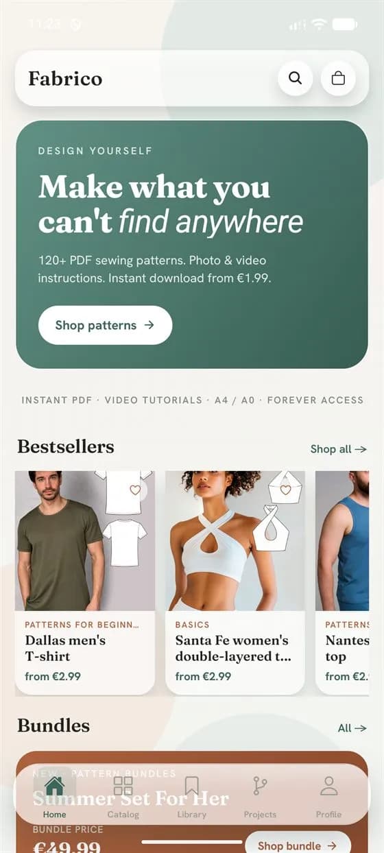
The first screen. The home screen doesn't open on a product grid. It opens on a story: a large image, a curated selection of bestsellers, featured collections. A first-time visitor sees a brand. A returning customer sees what's new.
The product page. Fabrico patterns are sold by size and height, and a size 40 in one height is a different cut from a size 40 in another. The old app made customers work through a table of options. Now there is a live picker: choose a size, choose a height, the price updates. One screen, one decision.
A starting point. A ten-question quiz asks what kind of sewing the customer does, their level and the garments they like to make. The answers map to one of six customer types. The result is a personal set of pattern recommendations and a 20% discount saved to the account.
Content and shop in one place. The Learning Hub, with the Fabrico blog, is built into the app. A customer reading about fabric choice can buy a pattern for that fabric without switching apps.
Everything after the purchase. Order history, a downloads library, size charts and how-to guides, behind one login.
Stripe's hosted payment page can't be embedded inside a native app. We built a session that runs the payment in the browser, watches the order until it settles and returns the customer to the app with the purchase confirmed and the download ready. From the customer's side: they paid, and the file appeared.
Three platforms — iOS, Android and the web — from one codebase. 18 screens and routes. About 4,800 lines of TypeScript. Three weeks for the full rebuild, redesign and delivery. The full story is in The shop was beautiful. On a phone, it wasn't.
An app is worth building when customers come back often enough to install it, or when it does something your website can't: a personal recommendation, a downloads library, an offline guide. If neither is true, make the mobile website fast and simple first. It's cheaper and reaches more people.
Three questions decide it:
Cost calculator
Related: What 57,494 owner messages taught us about trust · The gap between the pattern and the printer
Fabrico · Sewing patterns, e-commerce · International
3
platforms — iOS, Android, web — from one codebase
3 weeks
The same request. Very different answers.
Thirty minutes. You describe the pain and the result you want. We ask questions. If we can help, you get one email with what we found, what we'd build and what it costs. If we can't, we'll say so.